The 7 Upcoming Trends of Real Estate Marketing

The Real Estate Sector has always fascinated me with its unique marketing challenges.

It is perhaps the only case where the brand owners know exactly where their existing customers are – living inside their own product.

Secondly, even though it is about selling something concrete (no pun intended), the selling mostly happens even before the project is ready. So, the marketing takes on the dimension of selling a dream. A tangible dream, but dream nonetheless.

Most importantly, it is the highest involvement purchase that a family (or business owner, in case of a commercial property) makes. And there are dozens of factors that come into play while selecting a good property, right from price to quality of construction to the reputation of the builder and of course, the location, among many others.

Marketing a real estate property is now undergoing a dramatic shift with these upcoming trends. Only those who stay abreast of these changes will be able to create a brand for themselves.

Trend 1: Virtual and Augmented Reality Experiences

Virtual and Augmented Reality (VR/AR) technologies are revolutionizing the way properties are showcased to potential buyers. These immersive experiences allow buyers to explore homes remotely, visualize renovations, and get a real sense of the space before physically visiting a property. Expect to see a rise in virtual property tours, 360-degree videos, and interactive AR applications, enhancing the engagement and decision-making process for prospective buyers. At Quantum Quill, we have a team of expert VR professionals who can make a virtual tour of anything – from a modular kitchen to an upcoming metro city.

Trend 2: Drone Photography and Videography

Drone technology has become increasingly accessible and cost-effective, providing real estate professionals with stunning aerial views and unique perspectives of properties. Drone photography and videography capture the attention of buyers, offering a comprehensive view of the property, its surroundings, and nearby amenities. Wherever possible and allowed by law, utilize drones. They can create captivating visuals that highlight the property’s features, location, and architectural design, giving your marketing campaigns a competitive edge.

Trend 3: Personalized and Targeted Marketing

In today’s era of data-driven marketing, personalization and targeted advertising are becoming more prevalent in the real estate industry. Leverage customer data, including demographics, preferences, and online behavior, to deliver personalized marketing messages and offers to potential buyers. Utilize advanced targeting capabilities on social media platforms and online advertising networks to reach specific audiences based on location, income, interests, and more. Personalized marketing ensures that your message resonates with the right audience, increasing the chances of conversion.

Trend 4: Influencer Partnerships and User-Generated Content

Influencer marketing is a powerful tool to tap into niche audiences and build credibility in the real estate market. Collaborate with relevant influencers such as interior designers, lifestyle bloggers, or real estate experts to showcase your properties, share testimonials, and provide valuable insights. You can also encourage user-generated content by inviting satisfied customers to share their experiences on social media platforms. User-generated content serves as authentic social proof and can significantly impact potential buyers’ decision-making process.

Trend 5: Voice Search Optimization

With the rise of smart speakers and voice assistants, optimizing your real estate marketing for voice search is crucial. Homebuyers are increasingly using voice commands to search for properties, inquire about prices, and gather information. Optimize your website and online listings with long-tail keywords and natural language to ensure compatibility with voice search queries. Consider creating voice-enabled property search apps or integrating voice assistants into your website or chatbots for a seamless user experience.

Trend 6: Sustainable and Green Marketing

In an era of increasing environmental awareness, incorporating sustainability and green marketing strategies can set you apart from the competition. Highlight energy-efficient features, eco-friendly construction materials, and sustainable initiatives in your property listings and marketing materials. Showcase your commitment to environmentally conscious practices, such as LEED certification or renewable energy integration. By aligning your brand with sustainability, you attract buyers who prioritize eco-friendly lifestyles.

Trend 7: Artificial Intelligence and Chatbots

Artificial intelligence (AI) is revolutionizing customer service in the real estate industry. Implement chatbots on your website and social media platforms to provide instant responses to inquiries, qualify leads, and offer personalized property recommendations. AI-powered algorithms can analyze vast amounts of data to identify patterns, predict market trends, and provide valuable insights for better decision-making. Embrace AI tools and technologies to streamline processes, enhance customer experience, and gain a competitive advantage.

Do comment on this blogpost if you’d like to know more about real estate marketing (or branding).
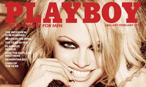
Playboy Articles. And the surprisingly memorable lesson you can learn from them.

One might snigger and wink at a person who says that he bought Playboy for its articles, but chances are that he’s dead serious about it. And he’s not alone. There are hundreds of thousands of them who used to buy that men’s “entertainment” magazine for the same reason.

So, what gives?

The key to understanding this delightful paradox lies in the word “Salience”. The dictionary meaning of Salience is the quality of being particularly noticeable or prominent.

The reason why the articles were memorable was because they were interspersed between titillating pictures. That’s what made them salient.

If you’ve ever made a powerpoint presentation, you’d have noticed that slides that are different from the rest or at least their preceding or following slides are better remembered by your audience. If you’re one of the smarter ones, you’d have leveraged this knowledge to deliberately draw attention to the important points you wish to make.

This principle of Salience could also be the reason why the beginnings and endings of books stick to the mind more than the middle – because there are elements at only on one side of them, instead of both.

Remember, it’s not the kind of stimulus that counts, but how it relates to the other stimuli surrounding it. Learn how to vary the proportions of stimuli, and you will enjoy the rewards of staying on people’s minds and compelling them to act.

Scarcity. How it surprisingly doomed a legendary brand.

Now, we all know how brands leverage the feeling of scarcity to sell their products faster.

“Limited Time Offer”

“Offer open till stocks last”

“Clearance Sale”

“Black Friday Sale”

“Exclusive Dhanteras Offer”

Not just that, many brands like Apple exploit the psychology of scarcity to make people queue up all night for their new phone launches.

But do you know there was a famous brand in US that got doomed due to this same psychology of scarcity.

In 1985, one of the top companies in the world began a historic blunder that Time magazine called the Marketing fiasco of the decade.

The name of the company – Coca Cola.

After years of researching on a new “better tasting” formula, on April 23, the company decided to pull their traditional formula of coke off the market. They replaced it with New Coke. But the company failed to predict the sheer frustration and fury its action would create. Right across the length and breadth of America, tens of thousands of Coke lovers rose up to revile the taste of New Coke and demand the return of their beloved old Coke back.

Their was even a society that got created – Old Coca Cola Drinkers of America – a widespread group of people who worked tirelessly to get the traditional formula back on the market by using any means necessary – civil, judicial, legislative…

The protests were of a level that made Coca Cola kill the New Coke and reinstate the old Coke.

What caused this outrage?

Even though blind taste tests clearly pointed to the new flavour as the hands down winner, the company failed to take into account something important. The taste tests were done with both flavours being made available to the participants. But when the Coke drinkers realised that the drink they grew up with will no longer be available, it created a psyche of scarcity, leading to an uprising, not unlike the bubbles of a well shaken coke bottle.

The Seven Mistakes of Brochure Designing.

The importance of a brochure has gone up in this digital age. Nothing beats the tactile satisfaction of flipping through a well-designed profile. However, designing a brochure is not as easy as it seems. Many brochure designs make any one (or more) of these basic mistakes. This reduces their visual appeal and therefore effectiveness as a sales or introduction tool:

  1. An Undefined Purpose and Audience: Before the designer starts putting the content together for a brochure, they should sharply define its purpose and audience. What do they want to achieve with the brochure? Who is the client’s target audience? Understanding these factors can help them determine the layout, content, and design elements that will best communicate the message.
  2. Complicated Design: A brochure should be easy to read and visually appealing. That’s why, the designer should avoid cluttering the design with too many images or text. It’s best to stick to a simple and clean layout that is easy to navigate. A consistent font and color scheme throughout the brochure creates a cohesive look.
  3. Low-Quality Images: Images are a crucial part of a brochure’s design. They help to convey the message and create visual interest. Use high-quality images that are relevant to the content of the brochure. Avoid using low-resolution or blurry images, as they can detract from the overall quality of the brochure. And as far as possible, don’t use stock images. It’s best to get photography done by a competent photographer. This will give the brochure an authentic feel.
  4. Unbalanced Text and Images: While images are essential, the text is equally important. Good designers use headlines and subheadings to break up large blocks of text and make the content easier to read. They also use bullet points to highlight key
    information. It’s important to strike a balance between text and images to create a brochure that is visually appealing and informative.
  5. Little Attention to Colour: Color can evoke emotions and influence the way people perceive your brand. Your designer should use a color scheme that is consistent with your brand identity and appeals to your target audience. Using too many colors can make the brochure look cluttered and confusing.
  6. The Wrong Paper: So, the design is done. Now is the time to carefully choose the paper. This can make a significant difference in the quality of your brochure. Choose a paper stock that is thick enough to withstand handling but not too heavy that it becomes difficult to fold. Consider using a glossy or matte finish to give the brochure a professional look. Ideally, you should request your printer to send you a paper sample booklet.
  7. No Call to Action: A brochure’s primary purpose is to encourage the reader to take action. Whether it is to make a purchase, visit your website, or contact your business. So do include a clear call to action in the brochure. Make it easy for the reader to take the desired action by providing contact information or a website URL.

By ensuring that you follow the above rules, you can ensure that your brochure effectively communicates your message, promotes your brand, and encourages the reader to take action. If you’d like to know more about how we at the monks design high impact brochures, do drop a comment on this blogpost.

The Science Behind Logo Design

Logo design is a critical aspect of branding and marketing, and it requires a careful understanding of the science behind creating an effective logo. A well-designed logo is not only aesthetically pleasing, but it also helps to convey the message and values of a brand to its target audience. In this article, we will explore the science of logo designing and the key principles that your logo designer should keep in mind.


Simplicity: The first and perhaps most important principle of logo design is simplicity. A simple logo is easy to recognize and remember, and it is more versatile in its use across various media. A complex logo, on the other hand, may be visually overwhelming and difficult to reproduce in different sizes and formats. A simple logo design can also convey a sense of elegance and sophistication, which can help to establish a brand’s credibility and professionalism. Take the logo above for example. Notice the smart way to leverage the initials of the name.

Color: Color is another crucial element of logo design. Different colors have different psychological associations and can evoke different emotions in the viewer. For example, red is often associated with passion and excitement, while blue is associated with calmness and trustworthiness. Similarly, green is about growth and Orange is about dynamism. Or you could break the rules a bit. Take a look at the logo above which was designed by us at the monks. Each colour family here represents the different sets of target audience for the brand and the hues point to the range of products under one roof. It’s important to choose colors that align with the brand’s values and message. Additionally, designers should consider the contrast and brightness of colors when creating a logo, as these factors can affect legibility and visibility.

Typography: Typography refers to the style and arrangement of text in a logo. The right typography can make a logo more visually appealing and memorable. It’s essential to choose a font that is easy to read and aligns with the brand’s personality. For example, a bold, sans-serif font may be suitable for a modern and edgy brand, while a classic, serif font may be more appropriate for a traditional and elegant brand. For instance, the logo above is for a brand of modern jewelry designed by the monks.

Scalability: A logo should be designed to be scalable, meaning that it can be easily resized without losing its quality or legibility. A logo that is too complex or has too many details may not be able to be scaled down to smaller sizes, which can make it difficult to use across different mediums, such as on social media or in print advertisements.

Timelessness: Finally, a well-designed logo should be timeless. It should not rely on current trends or fads, as these can quickly become outdated. A timeless logo can endure the test of time and continue to represent the brand for years to come. A good example of a timeless logo is the Coca-Cola logo, which has remained virtually unchanged since its creation in 1887.


In conclusion, logo design is a science that requires a deep understanding of the principles of simplicity, color, typography, scalability, and timelessness. You can ask your designer to follow these principles to create logos that are not only visually appealing but also effective in conveying the brand’s message and values to your target audience. A well-designed logo can help to establish your brand’s credibility and professionalism, and it can become a memorable symbol that represents the brand for years to come.

A surprising lesson in pricing

Robert Cialdini quotes two delightful anecdotes on pricing in his book “Influence”:

  1. A man opened a Native Indian Jewelry store in Arizona, USA. It was targeted to the tourists who thronged the area. There was a range of turquoise which was not moving off the shelves, even though they were of good quality. The shop owner tried every sales trick he knew. He had to leave town on a business trip. In exasperation, he left a note to the head
    saleswoman – “everything in this display case, price 1/2”. When he came back, to his relief, the entire stock was sold.

    But but but.

    There was a catch. The head saleswoman had actually misunderstood the instruction and instead of pricing the jewelry at half the price, she had priced them at double the cost!
  2. A man referred a close friend to a jewelry store owner who he happened to know very well. The friend wanted a ring for her girlfriend. Keeping in mind that the this gentleman has come with the reference of someone he knows so well, he showed him the ring but quoted only half the price – instead of $500, he asked for only $250. The man’s face fell and he backed away from the deal because he wanted something “really nice” for his intended bride.

    The next day, the jeweler realised the mistake he has done. He invited the man again to his store and showed a similar ring and quoted the regular price of $500. But then added that since he has come with a good reference and it’s a wedding gift, he will drop the price to $250.

    Guess what happened now?

    The man was overjoyed to get the deal.

What’s your learning from this? Do your customers buy your product only for its functional value? Can premium pricing also play a part in why they choose it?

Thinking of placing your product in Movies? Here is a shockingly effective tactic.

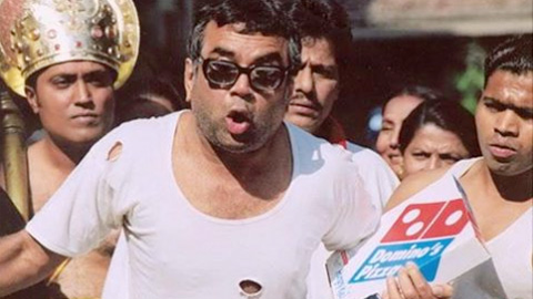
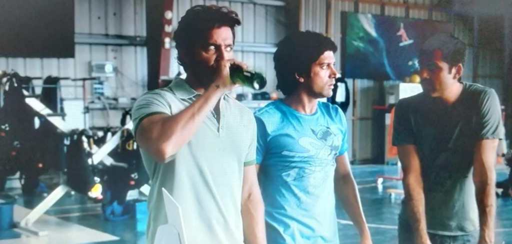
Remember that dominos scene in the movie ‘Phir Hera Pheri’? Or the Mountain Dew scene in ‘Zindagi na Milegi Dobara’?

While in the first movie, Paresh Rawal carries the Domino’s Pizza box throughout the scene and the scene ends with him plugging in the 30 minute delivery or free promise of the brand.

On the other hand, Hrithik Roshan simply signs a form, takes a gulp from a bottle of Mountain Dew and says to his 2 friends – I will see you outside. The bottle is visible for barely a second or two.

Which product placement do you think would be more effective?

If your answer is Domino’s, your view would be in line with the overriding belief of product placement practitioners. And you would be wrong!

In reality, it’s the more subtle the placement, the more effective it would be.

Yes, more prominent placement can lead to more recognition and recall of the brand, but it doesn’t lead to better sales.

This is borne out by a study done in the USA on product placements done in a hit comedy sitcom Seinfeld.

Shoppers who had watched the sitcom were observed. And it turned out that the more prominent brands on the series led to 27% of the audience buying them. While the subtly placed brands ended up being bought by 47% of the audience.

Surprised? Don’t be. This stems from the basic human truth – nobody likes to be sold to. And the moment we spot an overt effort to sell to us, we switch off our mind.

Do tell me your views in the comments.

A mind blowing fact about communication

I am reading the book ‘Influence’ by Robert Cialdini. In the first chapter itself he has knocked my socks off. Quoting a small passage from the first chapter. Read till the end:


“A well-known principle of human behaviour says that when we ask someone to do us a favour, we will be more successful if we provide a reason. People simply like to have reasons for what they do. Langer demonstrated this unsurprising fact by asking a small favour of people waiting in line to use a library’s copying machine: “Excuse me, I have five pages. May I use the Xerox machine, because I’m in a rush?” The effectiveness of this request-plus-reason was nearly total: 94 percent of people let her skip ahead of them in line.

Compare this success rate to the results when she made the request only: “Excuse me, I have five pages. May I use the Xerox machine?” Under those circumstances, only 60 percent complied. At first glance, it appears the crucial difference between the two request was the additional information provided by the words because I am in a rush.

However, a third type of request showed this was not the case. It seems it was not the whole series of words but the first one, because, that made the difference. Instead of including a real reason for compliance, Langer’s third type of request used the word because and then, adding nothing new, merely restated the obvious: “Excuse me, I have five pages. May I use the Xerox machine because I have to make some copies?” The result was again nearly all (93 percent agreed), even though no real reason, no new information was added to justify their compliance.”


Amazing isn’t it? So, will this new information change the way you make requests? Can it have any impact on your brand’s communication? Do leave a comment.

How brands paid tribute to Gandhi

Tactical advertising based on special occasions is a great opportunity to take your brand further. But very few manage to do it right.

Here are a few brands who got it absolutely right on Gandhi Jayanti. Has your brand done something phenomenal too? Do share.

Fevicol

Fevicol is always at the forefront of memorable advertising.

Fevikwik

This is what their sister brand did. Another winner!

Indigo

Indigo. They kept it simple and stark while remaining within their brand parameters. Perfect way to build the brand.

Greater Mumbai Police

Who would have thought that a government organisation could get this creative!

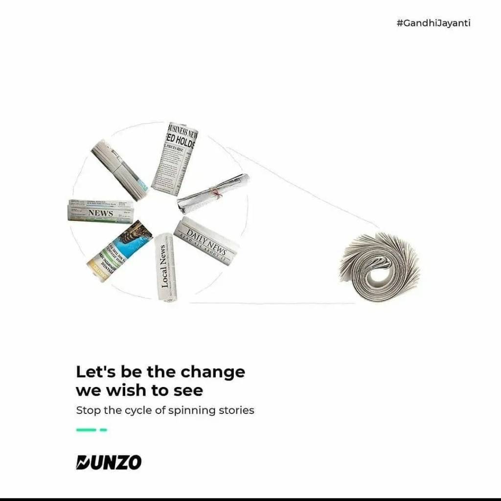
Dunzo

This Bangalore based food and grocery delivery company added value to the day by this relevant social message

Kia

Tilt your screen to see it from below… and Voila!

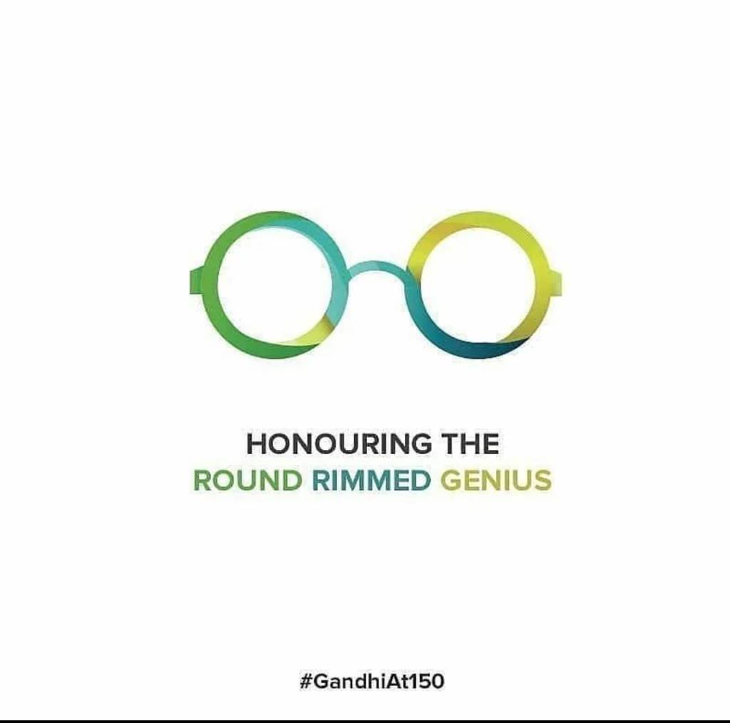
Lenskart

The height of simplicity, this didn’t even need the brand name. For me this is the winner.

So which one is YOUR favourite? Do share!

Is Modi the Greatest Marketing success story of our times?

namomerchan4

In January this year, Modi won the Philip Kotler Marketing Award. It later came to light that it was actually conferred by a shady Aligarh based organisation and the BJP website had to pull down the mention of the award after the controversy.

But the fact remains that Modi is the first politician Brand we know who has truly harnessed the power of Marketing. He has in fact, made the competition (read opposition) look like a deer fawn caught in front of headlights.

Let’s see how:

  1. Effective positioning:

In the run-up to the 2014 elections, he tapped into the widespread disaffection with the corruption and listless administration of the previous congress government. He positioned his government as a clean, responsive and development oriented alternative which catapulted him to power.

After 5 years of rule now, he has some notable successes to his credit (RERA, Digitalisation of government services, Electrification of Villages, Building of Toilets under Swachh Bharat Yojana to name some).
But there have been some failures too.
1. Start-up India has been a non-starter.
2. Smart Cities have also not been able to get off the ground.
3. The Make In India Initiative has been bogged down by the slower pace of Industrial growth compared to earlier years.
4. Clean Ganga has had little or no effect on the pollution levels of the river.
5. Corruption is far from over as demonstrated by the Rafaele controversy.
6. The return of black money from Swiss Banks still remains a pipe dream.
7. Perhaps his biggest failure has been Demonetisation which didn’t achieve a single objective he himself laid out when he announced it. To make matters worse, according to reports, it resulted in untold misery for farmers, small traders and economically marginalised people which they are yet to fully recover from.
So what does a brand do in such a situation? It repositions itself on a new platform. Modi is not mentioning any of his pet schemes and projects in his speeches. He is not even focussing on development this time around. He has instead reverted to the core legacy of his brand – Nationalism and Hindutva. And peppered it with a liberal dose of competition bashing.

2. Use of Social Media: In 2014, Modi didn’t just seize Social Media, he owned it. It helped that the other political parties in India were too laid back and set in their ways. Besides, FB and Twitter had not yet fully woken up to the potential for misuse of their platforms. For the first time perhaps, Indians came face to face with “bots”, “fake news” and “trolls”. Be that as it may, Modi did show his savvy to harness the social media platforms.
This time around, both platforms have been more vigilant against misuse. And the opposition, especially the Congress has a more professional approach to Social Media. All said and done, BJP still retains the pole position on the digital platform (Pro BJP pages accounted for 70% of the political adspend as per the latest data)

3. PR: Appointing the US based APCO as the PR firm was a wise move on the part of Modi. APCO has a wide experience in setting and changing narratives in elections and project the right image of presidential candidates. The campaign’s recent success was changing the narrative of “chowkidar chor hai” to “main bhi chowkidar”.

4. Use of Marketing Technology: Some of his innovations have created a lot of buzz – Selfie with Namo where you could take selfie with an image of Modi and the Hologram Trucks which roamed the countryside in 2014 projecting Modi’s 3D video of election speech. Add to that the Modi Biopic which is soon to be released, a modi web series by Eros Now and of course the Namo TV (the first TV dedicated to a single leader anywhere in the world).

5. Branding: His biggest masterstroke was to carefully brand himself as tea seller to gain empathy. He then went on to neatly turn individual units of his campaign into brands – Chai pe charcha, Main bhi Chowkidar, Namo Again,

6. Exploiting emotions, not facts: A mistake most marketers make is to focus solely on facts, completely forgetting that humans do not make decisions basis facts. Modi has turned appealing to emotions into a fine art. Look at some of the slogans of his campaign: Ab ki baar Modi Sarkar, Sabka Saath Sabka Vikas, Modi hai to mumkin hai, Har Har Modi Ghar Ghar Modi, Saaf niyat Sahi Vikas, Congress Mukt Bharat and the most famous of them all – achhe din aane wale hain

His decision to never take a press conference or unscripted interview is also a part of that grand strategy.

7. Use of merchandise: There was a time when we as kids used to mill around a stray congress vehicle to get our hands on a free badge. Well, badges are passe now. It’s branded mugs, t shirts, hoodies, key chains, fridge magnets, pens and exam warrior notebooks! Sold through merchandise vans and also online.

There are a lot of tips that marketers can take away from Modi and his marketing and PR team on how to manage a mega brand. If Modi comes back with majority again, it will be a further stamp on the effectiveness of his marketing initiatives.

(Please do leave a comment on the blogpost to give your feedback)